Pill Box is an e-pharmacy platform that can help people manage their prescriptions and find the lowest price for prescription drugs.
Background
In 2020, the U.S. spent $4 trillion, on national health expenditures, of which $358.7 billion was spent on prescription drugs.
8% of American adults don’t take their medicines as prescribed because they can’t afford them.
Most people very lack of knowledge in medicines and doctor’s prescriptions.

Objective
Design an e-commerce platform for people to
Maintain and organize records and information about their medication intake
Purchase medicine and health products at discounted price
Refill prescription easily
Set reminder for pill according the dosage and the times
Browse through a rich collection of health-related articles
Business Plan
-
Pill Box will offer an e-commerce platform for prescription drugs and healthcare products, better manage your prescriptions, remind you for your refill and medicine intake, enhance your healthcare knowledge.
-
• Digital Ads
• Social Media (Instagram, Facebook)
• Word of Mouth
• Mails, Offers
-
• People who are uninsured and underinsured, including an estimated 70 percent on high-deductible health plans.
• People ages 25–65, who are likely to take care children or elderly parent, and also they use e-commerce platform more frequently.
-
• Advertisement
• Referral fee
• Selling healthcare products
Empathy Map
Competitor Analysis Diagram
Direct Competitors: GoodRx, OptumRx, Blink Health, RxSaver, My Community Pharmacy.
Secondary competitors: Walgreens, Rite Aid, CVS, Safeway Pharmacy, Pharmacy.
Indirect Competitors: Lemonaid, RxLocal, Medscape, Medisafe, America's Pharmacy.

Competitive Feature Analysis

Personas
User Journey
Storyboard
Information Architecture
Low-Fidelity Wireframes

Key Features

-

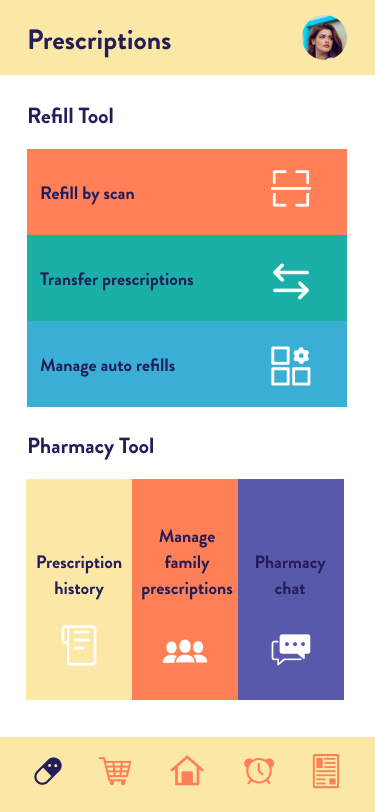
Prescriptions
Help you manage your prescriptions easily, you can refill and transfer prescriptions by scan.
-

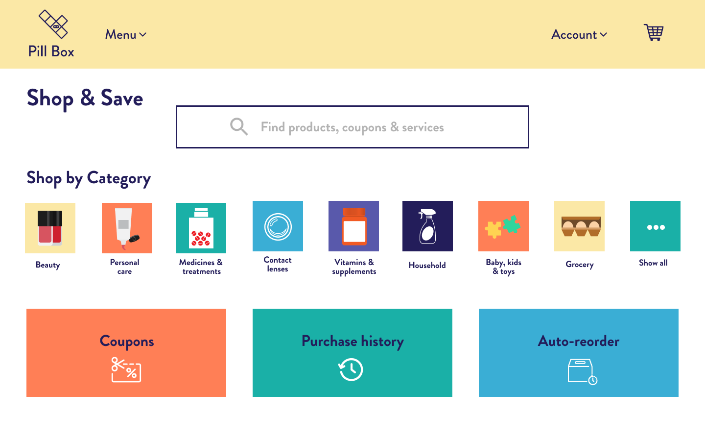
Shop & Save
You can save money by shopping the lowest price for prescription drugs and use coupons for other products.
-

Pill Reminder
Add pill reminders for your daily medications, so you won't forget to take pills on time.
-

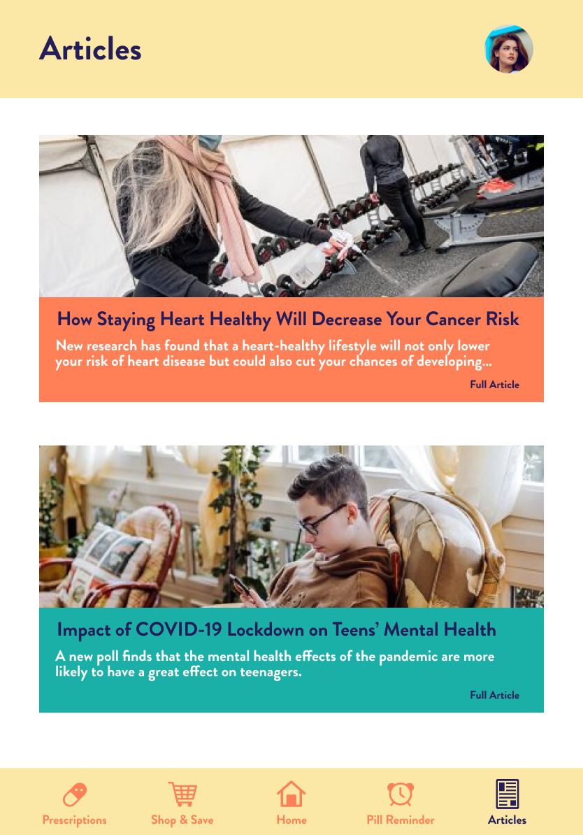
Articles
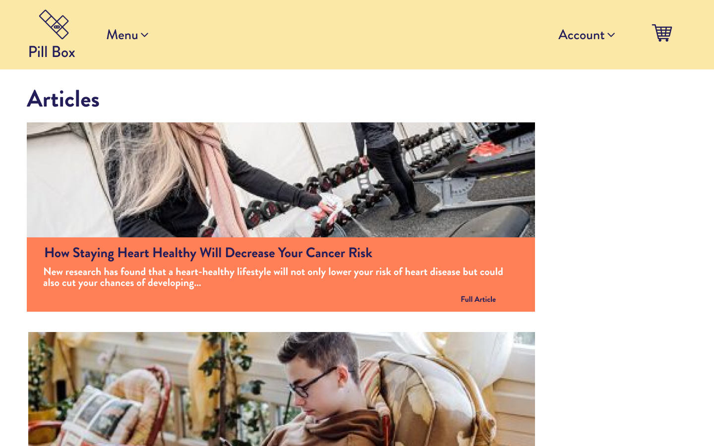
Browsing the newest health care related articles to enhance your knowledge.
Usability Testing
Improvements
Competitor + Market Branding Analysis
-
Color
To make the product is accessible for each and every potential user who is a potential patient, we would like to be bright/dark with cold pastel tones. The medical industry is expressed better with cold tones that are calming and soothing, so we do not want to pull too much attention.
-
Typography
To be a top usable brand, we choose to use sans-serif with a mixture of bold and thin typography.
-
Imagery
Alongside the seriousness, we will add a little bit cheekiness to make the product more fun. We will use both illustrations and lifestyle photos to make the product more unique.
Key Competitor Branding Analysis

Vision & Mission
Our vision is to be America’s most-loved e-pharmacy company, and to help people get the care they need to stay healthy.
— "What does the future looks like?"
Our mission is to build a place where people can manage their prescription easily and find the lowest prescription drugs with the highest quality.
— "What do we want to deliver with?"
Tone of Voice
-
Honest & Trustworthy
Be transparent with customers, show a deep understanding of customers’ needs and interests.
-
Professional
Provide accurate and reliable information and service to customers.
-
Caring
Take track on users' health condition, daily medications and monthly refills.

Design Principles

Ease-of-use
Since the target audience here is wide, we want to make sure our product is easy to access and use for every potential user regardless of age, income or education level. We want to help people on their path to better health.
Flexible
No matter you are using phone, tablet or laptop, our product will be flexible and functional to use.
Consistent
We want our product to have a consistent look and function in similar way, therefore, we can improve the usability and learnability.

Branding
UI Style Guide
Responsive Design



Wireframes
Prototype


